Technology Adoption
Let’s look at how widely the 10 features have been implemented now, and also how many respondents are planning to implement them soon…
If we then plug that into the Technology Adoption Lifecycle (see this blog post for more info), then we can see which group the feature is currently with.
If we then make an assumption that everyone who said that they were planning to implement the feature soon actually does so, and also does it before the end of 2007, then we can attempt to predict which group the feature will be with by the end of the year…
Remember, anything in green (i.e. over 16%) is said by Moore to have “crossed the chasm” and has the potential to become widely adopted.
In a future post, I’m going to try and look at how innovation and adoption is actually driven. My hunch is that it’s a small number of libraries who do the actual innovation (i.e. they are the risk takers and pioneers) and it’s the system vendors who then pick up the technology in the early adoption phase and help push it across the “chasm” into widespread adoption.
Category: OPAC Survey
OPAC Survey results – part 3
The last 3 graphs for today…
1) Feature Importance (UK Respondents)
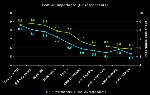
The difference in responses between UK (blue line) and non-UK respondents (green line).
One of the previous graphs shows that not many UK respondents are planning to implement faceted browsing, and here we see that the perceived importance in the UK is much lower than the rest of the world.
It’s interesting to speculate on why the UK resonpodents rated each feature lower than their counterparts around the world did.
2) Feature Importance (Library Type)
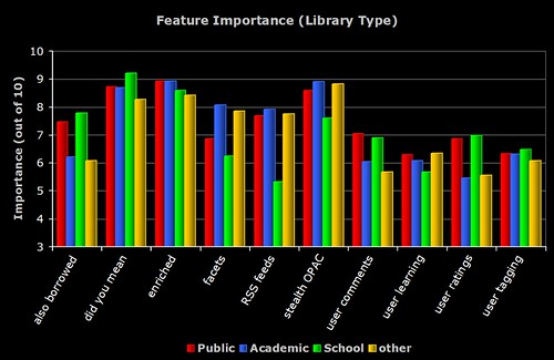
The breakdown of perceived importance by the different types of libraries who responded to the survey. Note the similarities and differences between the Academic and Public respondents.
3) Feature Importance (Country)
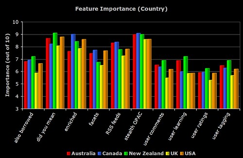
The breakdown of perceived importance by the major countries who responded to the survey. To be included, the country had to have more than 5 respondents.
OPAC Survey results – part 2
Here’s the next batch of results — this time lots of pretty graphs 😉
The shorthand descriptions for the features are as follows:
stealth OPAC — embedding the OPAC in other applications and getting the OPAC to where the user is
did you mean — spelling suggestions for search keywords
enriched — third party book cover scans, table of contents, trusted reviews, etc
RSS feeds — new book lists, RSS feeds of searches, search alerts, etc
facets — faceted browsing of results
also borrowed — “people who borrowed this also borrowed…” suggestions based on circulation data
user tagging — allowing the user to apply their own keywords (tags) to items in the OPAC
user comments — allowing the user to add their own reviews and comments to items in the OPAC
user learning — an “intelligent” OPAC that makes personalised suggestions based on what the user does
user ratings — allowing the user to add their own ratings or scores to items in the OPAC
1) Importance of Features and the Number of Implementations
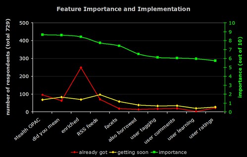
The green line (right hand axis) is the average perceived importance of the 10 OPAC features. The red line is number of respondents who have already implemented the feature, and the yellow line is the number who are planning to implement it soon.
2) Importance of Features and Predicted Number of Implementations
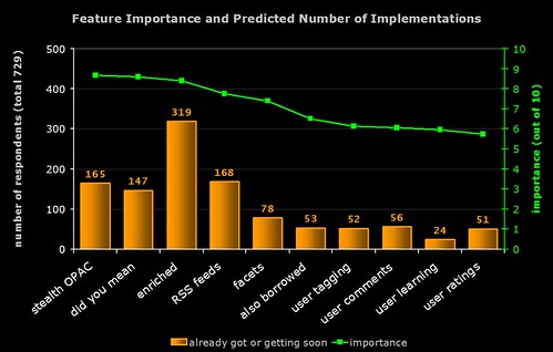
The green line (right hand axis) is the average perceived importance of the 10 OPAC features. The orange bar is number of respondents who have already implemented the feature or who are planning to implement it soon (i.e. the result of combining the red and yellow lines from the previous graph).
Note the high number of implementations of “enriched content”. In general, features with lower perceived importance are less likely to have been (or are about to be) implemented.
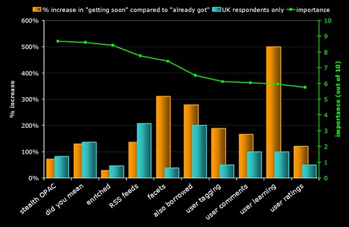
3) Rate of Increase of Feature Implementation
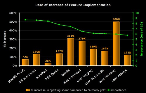
Time for some crystal ball gazing!
The green line (right hand axis) is the average perceived importance of the 10 OPAC features. The orange bar indicates the rate of increase in the implementation of the feature (calculated by dividing the number of people who are planning to implement it by the number of people who already have and expressing the result as a percentage).
For example, 249 respondents already have enriched content and 70 are planning to get it soon:
70 / 249 x 100 = 28.1%
Note that many of the features that (on average) have lower perceived importance are actually the ones whose rate of implementation is highest.
The graph indicates that "learning OPACs" (e.g. OPACs that give the user personalised suggestions and learn from what they do) are potentially the "next big thing"!
4) Feature Importance
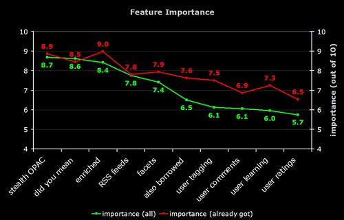
The green line is the average perceived importance of the 10 OPAC features. The red line is the perceived importance from those respondents who have actually implemented that feature.
Note that the difference in the perceived importance of the more "2.0" features (tagging, comments, etc). Does this mean those who have implemented these features are reaping the benefits?
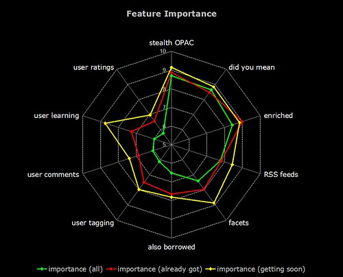
5) Feature Importance
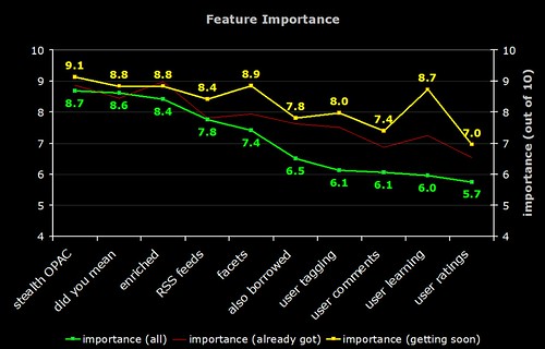
The green line is the average perceived importance of the 10 OPAC features. The faint red line is the perceived importance from those respondents who have actually implemented that feature. The yellow line is the perceived importance from those respondents who are planning to implement that feature soon.
Note that the difference in the perceived importance of the more "2.0" features (tagging, comments, etc). The "getting soon" respondents certainly have high expectations!
And now, the same data on a radar graph (for those who prefer this format)…
6) Feature Implementation (UK)
The same graph as (3) but with a blue bar showing the rate of implementation in the UK. Why is faceted browsing so low on the agenda for UK libraries? Are US libraries more aware of this feature due to the high publicity surrounding North Carolina’s OPAC?
OPAC Survey results – part 1
A few hours earlier than planned, but the informal OPAC Survey has now closed. Many thanks to everyone who responded — all 729 of you! 🙂
Here’s how the responses break down by geographical region:
After a few days, I added a question that allowed respondents to identify what type of library they worked for — 233 people answered:
Discounting regions and library types where there were 5 or less responses, here’s how the responses broke down for the first 3 sections of the survey…
1) OPAC Happiness
On a scale of 1 to 10 (where 1 is extremely unhappy and 10 is extremely happy), how happy are you with your OPAC?
2) Cutting Edge or Yesterday’s News?
One criticism of OPACs is that they rarely have cutting edge features (or perhaps even basic features) that our users expect from modern web sites. On a scale of 1 to 10, how well do you think your OPAC meets the needs and expectations of your users?
If “2007” represents a cutting edge OPAC with all the features both you and your users would expect, how far in the past do you feel your current OPAC is?
Have you ever suffered from “OPAC envy” when looking at someone else’s OPAC?
3) Child’s play?
On a scale of 1 to 10 (where 10 is extremely easy), how easy do you find your OPAC is to use?
On a scale of 1 to 10 (where 10 is extremely easy), how easy do you think one of your average users finds your OPAC is to use?
On a scale of 1 to 10 (where 10 is extremely important), how important do you think it is that an OPAC is easy and intuitive to use?
Do you run any face-to-face training or induction/introduction courses on “how to use” the OPAC with your users?
…more results to come tomorrow morning!
Quick OPAC Survey – update 1
Wow — the OPAC survey has now had over 650 responses! I really can’t say this enough times, but thanks to everyone who has responded so far.
http://www.daveyp.com/files/stuff/opac.html
The survey has already been posted on the SirsiDynix Horizon and IPAC mailing lists, but it would be great to get more responses from the users of other systems. If anyone is willing to post a link to the survey in a mailing list for any of the other systems, then please do.
I’m planning to close the survey on Saturday 14th April and will post the main results on (or before) April 17th. Quite a bit of the data will be included in the presentation I’m giving at LiS 2007 on the 18th.
The full results from the survey will be published in an informal report sometime around the middle of May. This report will include:
- all of the comments from the respondents
- tables of the data, broken down by multiple criteria
- lots of pretty graphs(!)
- conclusions and predictions based on the data
The comments alone currently run to nearly 40 pages and provide a unique insight into our love/hate relationship with the OPAC.
As a taster of things to come, here are some breakdowns taken from the responses to date…
Countries represented
There have been responses from virtually every corner of the globe and the current breakdown is as follows (based on IP address of respondent):
- Australia — 21
- Canada — 41
- Germany — 2
- Greece — 2
- Hong Kong — 2
- Ireland — 3
- New Zealand — 8
- Sweden — 4
- UK — 155
- USA — 408
China, Denmark, Italy, Lebanon, Luxembourg, Netherlands, Peru, and Spain have all had 1 respondent each.
I’ve yet to do a full breakdown of results by all countries, but here are some of the facts for the countries where there have been at least 10 responses:
- Canadians are the least happy with their OPACs (4.37 out of 10) whilst the UK is the happiest (5.81 out of 10)
- The UK respondents generally think the OPAC features listed in the survey are less important than the rest of the world does
- Australians suffer the most from “OPAC envy” with 86% saying they’d experienced it (or perhaps Aussies are the most honest people in the world?)
- Respondents from the UK were the least likely to experience envy with just 72% admitting to it
- Australians are the most likely to offer OPAC training to their users (81%) and Canadians the least likely (61%)
Library type
As mentioned before, I’ve kicked myself for not asking respondents to say what type of library they are from. However, I added the question to the survey a couple of days ago and nearly 160 respondents have replied since then. The breakdown is:
- academic — 92
- public — 45
- other — 14
- school/K12 — 6
It would be great to get some more responses to bump those figures up, but here’s how academic and public libraries compare so far:
- publics rate the “people who borrowed this” feature more highly (7.6 out of 10 compared to 6.2 for academics)
- publics rate enriched content (book covers, etc) slightly more highly (8.9 out of 10 compared to 8.5 for academics)
- academics rate facetted browsing more highly (8.1 out of 10 compared to 7.3 for publics)
- publics rate user supplied comments much more highly (7.3 out of 10 compared to 5.9 for academics)
- publics rate user supplied ratings much more highly (7.1 out of 10 compared to 5.3 for academics)
- academics are much more likely to offer OPAC training to their users (74% compared to 53% of publics)
…apart from the above, the responses from public libraries and academic ones have been very similar.
OPAC features
I’ve got some really exciting data here that I’m going to hold off from posting it all until the survey closes (I’m such a tease!).
If you take the Crossing the Chasm adoption curve and apply the boundary values from the more well known Technology Adoption LifeCycle (E.M. Rogers)…

- Innovators — 2.5%
- Early Adopters — 13.5%
- Early Majority — 34%
- Late Majority — 34%
- Laggards — 16%
…then the current state of play of the 10 OPAC features in the survey (calculated from the number of respondents who said that they had already implemented the feature) is:
Innovators:
- OPACs that make personalised suggestions (like Amazon does)
- “people who borrowed this” suggestions
Early Adopters:
- user supplied tagging
- facetted browsing
- user supplied comments
- user supplied ratings
- “did you mean” spelling suggestions
- RSS feeds
- embedding the OPAC into other places
Early Majority:
- enriched content (book covers, etc)
…in other words, only enriched content has jumped “the chasm” into mainstream acceptance.
If we assume that everyone who said that they were planning to implement a feature soon actually does so before the end of 2007, then 3 of the 7 features currently in the Early Adopters group will also have jumped the chasm to reach Early Majority (and mainstream acceptance?) by the start of 2008 — can you guess which 3 they are?
Also, if we continue with that assumption, the 2 features currently in the Innovators group will have moved into the Early Adopters group.
So, if you are craving these “more cowbell” features, it would appear that all of them are taking little baby steps towards an OPAC near you. How long each of them will take to arrive is the next big question and I’ll be offering some informed speculation based on the data once the survey has closed!
Quick OPAC Survey
I’m giving a short presentation about OPACs at the Library and Information Show in April and I’d be really grateful to any librarians reading this blog post who would be happy to respond to a quick survey about the subject:
http://www.daveyp.com/files/stuff/opac.html
I’m planning to include results from this quick survey in my presentation and I’ll post the full results here on the blog.
Many, many thanks in advance to anyone who responds!