Bryony and I have been in Barcelona now for just over 24 hours and my feet are already knackered from all the walking we’ve done!
The joint DUG/EUUG SirsiDynix Conference starts on Wednesday, but we decided to fly out for a few days of sightseeing in advance.
A few of the photos from today and yesterday are on Flickr, although I haven’t finished tagging and adding descriptions yet…


Month: April 2007
Oh God, I feel so old!
Quite a few things have happened this year that have reminded me I’m in my mid 30s.
The latest is this article on the BBC News website: How the Spectrum began a revolution

…yep, it’s 25 years ago today since Sir Clive Sinclair unleashed the follow up to the ZX81!
I can clearly remember the day I first saw a ZX Spectrum — it was at Alex Mitchell’s house and he’d got “Escape” from New Generation Software:

At the time I still had a ZX81, but somewhere around the end of 1982 I’d sold that and had enough money to buy a 48K ZX Spectrum. I think it took me nearly 30 minutes to decide which game I should buy first — eventually I chose the fantastic “Atic Atac” from Ultimate 🙂

Pretty soon I’d taught myself Sinclair BASIC, and then Z80A assembly language (now that’s hardcore!). I’m sure all of those hours staring at a black & white portable TV didn’t do my eyes any good, but my love of coding and programming can definitely be traced back to those many evenings spent prodding away at the “dead flesh” keyboard.
I think I’ve still got my Spectrum somewhere, but these days it’s much easier just to fire up an emulator.
William Morris Gallery
Just spotted that the Waltham Forest Council is cutting back funding to the William Morris Gallery in London. I’m sure many of you will already be familiar with his work but, if not, check out the Wikipedia article.
If you are an aficionado of Morris’ work, then you might want to head over to the Save William Morris Gallery & Vestry House Museum website, where there’s a link to an online petition.
The architectural critic and writer Jonathan Glancey wrote an article in The Guardian this week:
The London borough of Waltham Forest says it needs to cut costs. …The aim, say many local people together with defenders of the gallery – including Tony Benn, and Morris’s biographer, Fiona McCarthy – is to prepare the way for complete closure.
Fans of Alfred Hitchcock might be interested to know that his birthplace of Leytonstone is part of the Waltham Forest borough, and is only about 3 miles from the museum.
100,000 ideas!
I totally failed to spot that the Library 2.0 Idea Generator has now created over 100,000 ideas!
I’ve no idea what the 100,000th idea actually was, but I hope it was “Build an Idea Generator and sell it to Google for $1,000,000”.
Around about 1% of the ideas were of high enough quality that the viewer added it to the whiteboard. I gave up counting how many of them reference Michael Gorman, but here’s a few that caught my eye…
– investigate Michael Gorman and use him to replace all of your librarians
– closely scrutinize Michael Gorman and then paint him purple
– create Stephen Abram just to annoy Michael Gorman
– write a song about Michael Gorman just to confuse Michael Gorman
– enhance Michael Gorman for the Millennials
– repurpose Michael Gorman and then replace him with a robot
– replace Michael Gorman using Firefox
– add the Netflix model just to annoy Michael Gorman
…poor Mr Gorman — what did he ever do to you?
I must admit, most of my favourite ideas involve the Library 2.0 World movers and shakers…
– vigorously shake Lorcan Dempsey and upload the result to YouTube
– invert Lorcan Dempsey and then paint him purple
– closely scrutinize Leslie Burger and then visualise her as a tag cloud
– digitize Meredith Farkas and observe her from a suitable distance (see here for the result)
– write a song about Walt Crawford and publicise it on your plasma screen
– fall in love with Stephen Abram and embed him into a portal
– impress Michael Stephens and upload the result to YouTube
– podcast about your podcasts and then blame Michael Stephens when it doesn’t work
– unlock the latent forces within Jenny Levine and then run through your library screaming ”it’s all too much!”
If you’ve got a favourite idea from the whiteboard, or if you’ve actually been inspired by one of the ideas, please let me know!
OPAC Survey results – part 8
Library and Information Show 2007
I’ve just about recovered from LiS 2007 and hopefully I didn’t cram too much into the 30 minutes I had for my session!
There’s a few photos from the event on Flickr…


OPAC Survey
I think the previous post will be the last batch of graphs unless I uncover something new in the data. Instead, many thanks to my colleague Lisa (Senior Assistant Librarian for Applied Sciences and Computing & Engineering) for sifting through the respondent comments for the common themes. The full figures will be in the report, but here’s a snifter of the “feature comments”…
The most common wanted feature was federated searching (both electronic resources and other libraries’ holdings), with over 30 responses.
Next up, being able to customise the OPAC (look & feel and adding new features), with over 15 comments.
Relevancy ranking was specifically mentioned by at least 10 respondents, with 9 wanting personal borrowing histories, Amazon style wish lists, and saved session results.
1 respondent wanted to be able to search by colour of cover and another wanted wiki style functionality adding to the OPAC.
For the “final comments” section, here’s a sample…
10 respondents felt that “2.0” style features could be a distraction and that the OPAC should be kept simple. Another 10 said that lack of staff expertise or money was stopping them from being able to make the changes they would like to their OPACs.
However, the most common theme was laying the blame squarely at the feet of the vendors — broken promises, slowness of feature delivery, etc.
Lisa also picked out a handful of the comments that she felt stood out and here’s just 3 of them…
It seems that OPACs are too busy trying to please every customer. They spend too much time developing and not nearly enough time releasing software. The ability of the library to customize the OPAC should be the primary feature. Developing extensive APIs and building in flexibility should be at the top of the list for development. Let librarians develop the specific tools they want or need. Allow librarians to create add-ons and templates and distribute them to other libraries. OPAC vendors need to concentrate on search technology and not the next great feature.
I think we should always keep in mind the key aim of the OPAC is so users can locate/access resources. These new web 2.0 type enhancements can be fantastic, but there is a danger in using them just because we think we should.
We took a risk in 2002 and extensively customized our OPAC outside the confines of vendor support. Our efforts have been extremely successful and it has essentially become our new model for the direction we’re heading in the future. We’ll be doing MORE customization and application development in the future, rather than less. We’re much more likely now to move away from traditional library automation vendors as we consider what comes next.
(Phil Feilmeyer, Hennepin County Library)
OPAC Survey results – part 7
Yesterday, Owen Stephens asked for more details about feature importance breakdowns for each vendor by type of library.
As a caveat, please take into account the number of respondents for each group:
Talis – 6 academic
SirsiDynix – 23 academic & 33 public
III – 22 academic & 7 public
Ex Libris – 51 academic
That leaves 46 other academic and 35 other public respondents who either use a system from another supplier, or didn’t state which vendor or system they used. Their responses are included as part of the grey average bars in some of the graphs.
I might also attempt a second set of graphs to split out the Unicorn & Dynix/Horizon respondents, and the Aleph & Voyager respondents for each library type.
Finally, as with some of the other graphs, the Y axis doesn’t always start at zero. Personally I prefer to be able to concentrate on the differences in the bar heights and I tend to adjust the Y axis start value accordingly. If you prefer to see the true size of the bars (i.e. with the Y axis starting a zero), please let me know and I’ll upload new graphs.
1) Feature Importance – all 6 groups
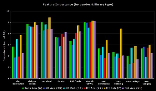
A busy graph, but one that does draw out some of the differences between all of the groups.
In 9 out of the 10 features, it’s the seven III public respondents who are giving the highest perceived importance. Only faceted browsing sees the Ex Libris academic respondents getting the highest importance rating.
With the “user learning” (i.e. OPAC that makes personalised recommendations for each user), none of the III public respondents either have the feature or are planning to implement it (even though the regard it as a relatively high importance). Four of the Ex Libris academic respondents are planning to implement the feature soon (does Primo offer this?).
2) Feature Importance – academic only

The same data as the first graph, but this time only showing the academic respondents. I count the six Talis respondents as giving the highest importance rating to 6 of the features, then Ex Libris get 3, and then 1 (user tagging) from SirsiDynix.
The Talis repsondents are all from the UK, so it’s worth remembering that (on average) the 171 UK respondents always gave lower ratings to the features than non-UK respondents. I’m going to go out on a limb here and say that I believe this is down to all of the “2.0” work and promotion Talis have been doing recently.
The grey bar shows the average from all of the 148 academic respondents.
3) Feature Importance – public only
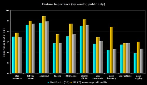
The same data as the first graph, but this time only showing the public respondents. For all 10 features, it’s the seven III respondents who give the highest ratings.
The grey bar shows the average from all of the 75 public respondents.
4) Feature Importance – SirsiDynix only
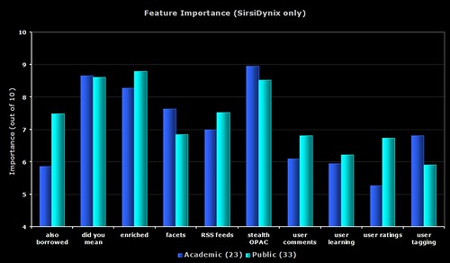
The same data as the first graph, but this time only showing the SirsiDynix respondents.
5) Feature Importance – III only
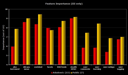
The same data as the first graph, but this time only showing the III respondents.
6) Feature Importance – each group compared to average
I’m sure you’re all getting graph fatigue (grafatigue?) now, so I’ll just give you links to the images on Flickr. Each graph shows the response from the group compared with the average from all respondents for that library type.
Talis – academic
SirsiDynix – academic
III – academic
Ex Libris – academic
SirsiDynix – public
III – public
OPAC Survey results – part 6
Part way through the survey, I added an optional question to allow respondents to specify which ILS product they use.
Here’s the breakdown of average responses to the following questions (which all asked the respondents to give a rating out of 10)…
1) easy for you — how easy do you (i.e. the respondent) find your OPAC is to use
2) easy for user — how easy do you think an average user/patron finds your OPAC is to use
3) meets user needs — how well do you think your OPAC meets the needs and expectations of your users
4) your happiness — how happy overall are you with your OPAC
By Product
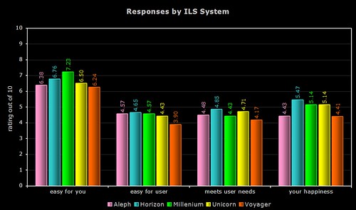
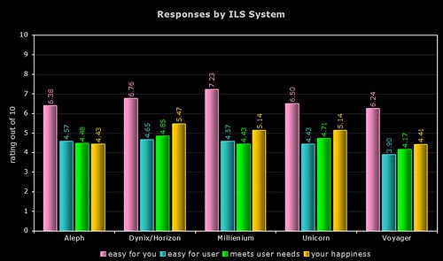
Quite a few respondents simply listed their vendor (e.g. “SirsiDynix” or “Ex Libris”), so the above two graphs only use data from the responses where the actual system was named. As the Dynix ILS and Horizon use the same OPAC (HIP), I’ve grouped their responses together.
By Vendor
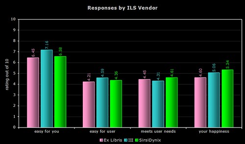
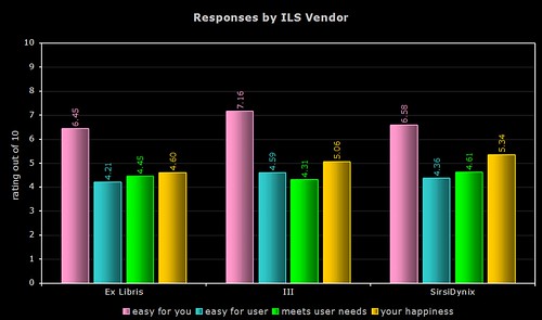
The above two graphs use more raw data (a total of 154 respondents, including the responses where only the vendor was named). As most of you will know, Ex Libris and SirsiDynix support more than one OPAC product.
Comments
I’m not sure that any one system or vendor comes out smelling of roses (or stinking of horse manure!), and I certainly wouldn’t suggest you base your next ILS choice on the results, but here’s a few comments…
1) ease of use for the respondent
Innovative and their Millenium product are the clear winners here, with nearly a gap of 0.99 between them and last place Voyager. Overall, the Ex Libris products get the lowest ratings.
2) ease of use for users/patrons
The Dynix/Horizon OPAC wins by a nose, with a noticeable gap between last place Voyager and the others.
3) meets the needs and expectations of users/patrons
Again, the Dynix/Horizon OPAC wins, with the other SirsiDynix OPAC (Unicorn) coming in second. Once again, Voyager comes last of the five.
4) overall happiness
For the third time, the Dynix/Horizon OPAC wins, with the two Ex Libris products coming last.
OPAC Survey results – part 5
Some more graphs — this time, further breakdowns of “feature importance”…
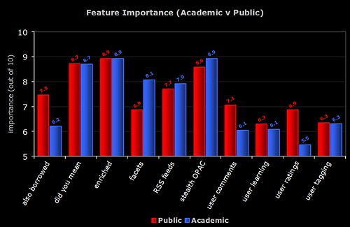
1) Academic v Public
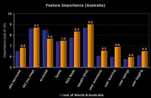
2) Australian Respondents
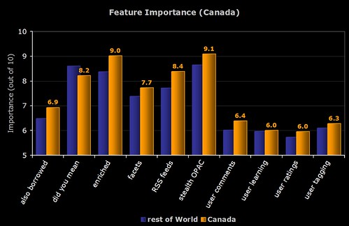
3) Canadian Respondents
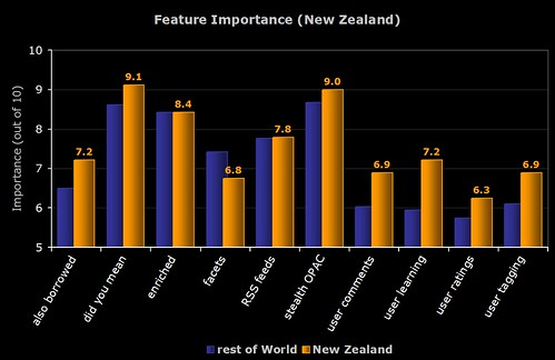
4) New Zealand Respondents
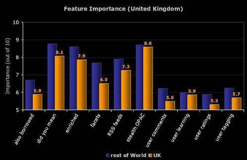
5) UK Respondents
6) American Respondents
OPAC Survey results – part 4
Technology Adoption
Let’s look at how widely the 10 features have been implemented now, and also how many respondents are planning to implement them soon…
If we then plug that into the Technology Adoption Lifecycle (see this blog post for more info), then we can see which group the feature is currently with.
If we then make an assumption that everyone who said that they were planning to implement the feature soon actually does so, and also does it before the end of 2007, then we can attempt to predict which group the feature will be with by the end of the year…
Remember, anything in green (i.e. over 16%) is said by Moore to have “crossed the chasm” and has the potential to become widely adopted.
In a future post, I’m going to try and look at how innovation and adoption is actually driven. My hunch is that it’s a small number of libraries who do the actual innovation (i.e. they are the risk takers and pioneers) and it’s the system vendors who then pick up the technology in the early adoption phase and help push it across the “chasm” into widespread adoption.
OPAC Survey results – part 3
The last 3 graphs for today…
1) Feature Importance (UK Respondents)
The difference in responses between UK (blue line) and non-UK respondents (green line).
One of the previous graphs shows that not many UK respondents are planning to implement faceted browsing, and here we see that the perceived importance in the UK is much lower than the rest of the world.
It’s interesting to speculate on why the UK resonpodents rated each feature lower than their counterparts around the world did.
2) Feature Importance (Library Type)
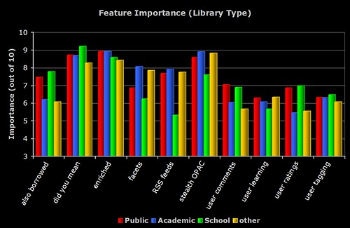
The breakdown of perceived importance by the different types of libraries who responded to the survey. Note the similarities and differences between the Academic and Public respondents.
3) Feature Importance (Country)
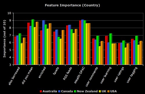
The breakdown of perceived importance by the major countries who responded to the survey. To be included, the country had to have more than 5 respondents.