Yesterday, Owen Stephens asked for more details about feature importance breakdowns for each vendor by type of library.
As a caveat, please take into account the number of respondents for each group:
Talis – 6 academic
SirsiDynix – 23 academic & 33 public
III – 22 academic & 7 public
Ex Libris – 51 academic
That leaves 46 other academic and 35 other public respondents who either use a system from another supplier, or didn’t state which vendor or system they used. Their responses are included as part of the grey average bars in some of the graphs.
I might also attempt a second set of graphs to split out the Unicorn & Dynix/Horizon respondents, and the Aleph & Voyager respondents for each library type.
Finally, as with some of the other graphs, the Y axis doesn’t always start at zero. Personally I prefer to be able to concentrate on the differences in the bar heights and I tend to adjust the Y axis start value accordingly. If you prefer to see the true size of the bars (i.e. with the Y axis starting a zero), please let me know and I’ll upload new graphs.
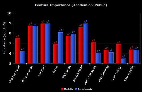
1) Feature Importance – all 6 groups
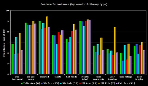
A busy graph, but one that does draw out some of the differences between all of the groups.
In 9 out of the 10 features, it’s the seven III public respondents who are giving the highest perceived importance. Only faceted browsing sees the Ex Libris academic respondents getting the highest importance rating.
With the “user learning” (i.e. OPAC that makes personalised recommendations for each user), none of the III public respondents either have the feature or are planning to implement it (even though the regard it as a relatively high importance). Four of the Ex Libris academic respondents are planning to implement the feature soon (does Primo offer this?).
2) Feature Importance – academic only

The same data as the first graph, but this time only showing the academic respondents. I count the six Talis respondents as giving the highest importance rating to 6 of the features, then Ex Libris get 3, and then 1 (user tagging) from SirsiDynix.
The Talis repsondents are all from the UK, so it’s worth remembering that (on average) the 171 UK respondents always gave lower ratings to the features than non-UK respondents. I’m going to go out on a limb here and say that I believe this is down to all of the “2.0” work and promotion Talis have been doing recently.
The grey bar shows the average from all of the 148 academic respondents.
3) Feature Importance – public only
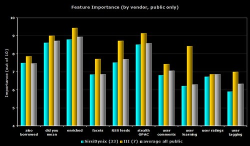
The same data as the first graph, but this time only showing the public respondents. For all 10 features, it’s the seven III respondents who give the highest ratings.
The grey bar shows the average from all of the 75 public respondents.
4) Feature Importance – SirsiDynix only
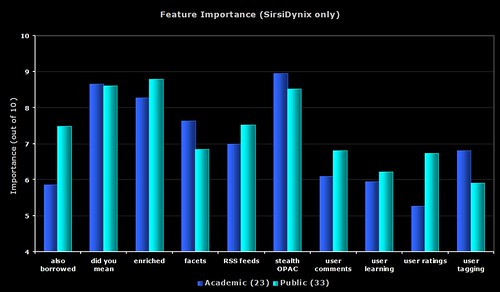
The same data as the first graph, but this time only showing the SirsiDynix respondents.
5) Feature Importance – III only
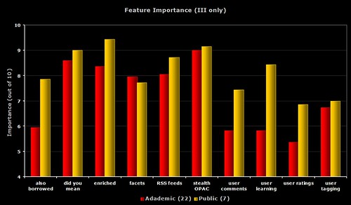
The same data as the first graph, but this time only showing the III respondents.
6) Feature Importance – each group compared to average
I’m sure you’re all getting graph fatigue (grafatigue?) now, so I’ll just give you links to the images on Flickr. Each graph shows the response from the group compared with the average from all respondents for that library type.
Talis – academic
SirsiDynix – academic
III – academic
Ex Libris – academic
SirsiDynix – public
III – public
OPAC Survey results – part 6
Part way through the survey, I added an optional question to allow respondents to specify which ILS product they use.
Here’s the breakdown of average responses to the following questions (which all asked the respondents to give a rating out of 10)…
1) easy for you — how easy do you (i.e. the respondent) find your OPAC is to use
2) easy for user — how easy do you think an average user/patron finds your OPAC is to use
3) meets user needs — how well do you think your OPAC meets the needs and expectations of your users
4) your happiness — how happy overall are you with your OPAC
By Product
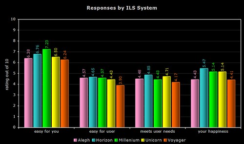
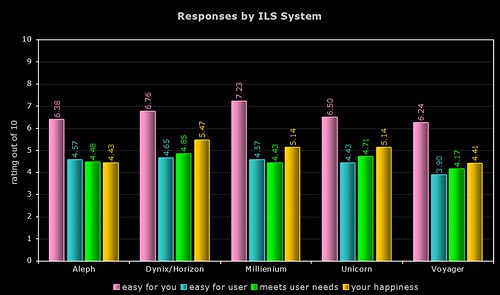
Quite a few respondents simply listed their vendor (e.g. “SirsiDynix” or “Ex Libris”), so the above two graphs only use data from the responses where the actual system was named. As the Dynix ILS and Horizon use the same OPAC (HIP), I’ve grouped their responses together.
By Vendor
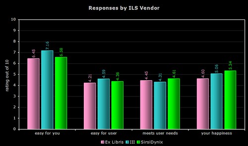
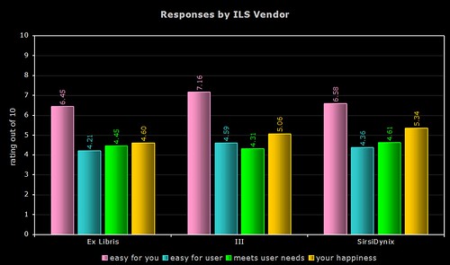
The above two graphs use more raw data (a total of 154 respondents, including the responses where only the vendor was named). As most of you will know, Ex Libris and SirsiDynix support more than one OPAC product.
Comments
I’m not sure that any one system or vendor comes out smelling of roses (or stinking of horse manure!), and I certainly wouldn’t suggest you base your next ILS choice on the results, but here’s a few comments…
1) ease of use for the respondent
Innovative and their Millenium product are the clear winners here, with nearly a gap of 0.99 between them and last place Voyager. Overall, the Ex Libris products get the lowest ratings.
2) ease of use for users/patrons
The Dynix/Horizon OPAC wins by a nose, with a noticeable gap between last place Voyager and the others.
3) meets the needs and expectations of users/patrons
Again, the Dynix/Horizon OPAC wins, with the other SirsiDynix OPAC (Unicorn) coming in second. Once again, Voyager comes last of the five.
4) overall happiness
For the third time, the Dynix/Horizon OPAC wins, with the two Ex Libris products coming last.
OPAC Survey results – part 5
Some more graphs — this time, further breakdowns of “feature importance”…
1) Academic v Public
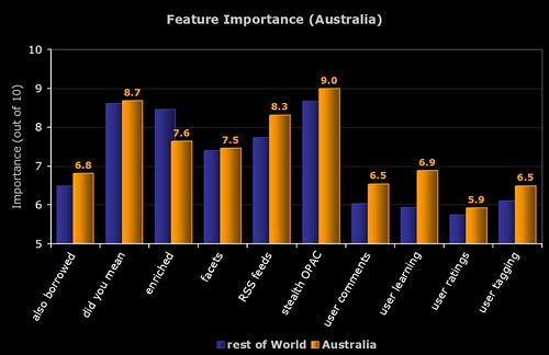
2) Australian Respondents
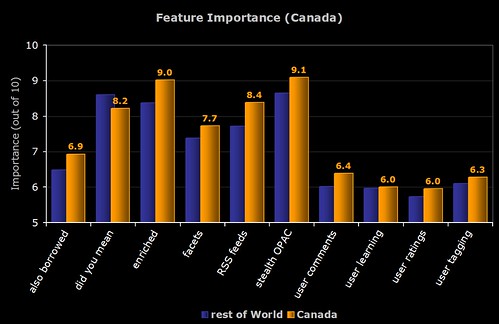
3) Canadian Respondents
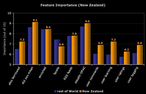
4) New Zealand Respondents
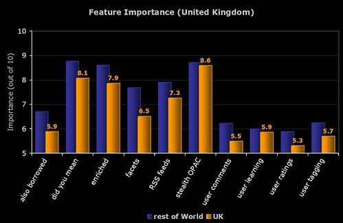
5) UK Respondents
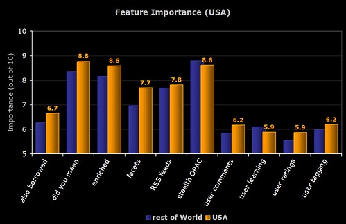
6) American Respondents
OPAC Survey results – part 4
Technology Adoption
Let’s look at how widely the 10 features have been implemented now, and also how many respondents are planning to implement them soon…
If we then plug that into the Technology Adoption Lifecycle (see this blog post for more info), then we can see which group the feature is currently with.
If we then make an assumption that everyone who said that they were planning to implement the feature soon actually does so, and also does it before the end of 2007, then we can attempt to predict which group the feature will be with by the end of the year…
Remember, anything in green (i.e. over 16%) is said by Moore to have “crossed the chasm” and has the potential to become widely adopted.
In a future post, I’m going to try and look at how innovation and adoption is actually driven. My hunch is that it’s a small number of libraries who do the actual innovation (i.e. they are the risk takers and pioneers) and it’s the system vendors who then pick up the technology in the early adoption phase and help push it across the “chasm” into widespread adoption.
OPAC Survey results – part 3
The last 3 graphs for today…
1) Feature Importance (UK Respondents)
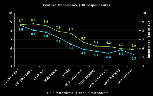
The difference in responses between UK (blue line) and non-UK respondents (green line).
One of the previous graphs shows that not many UK respondents are planning to implement faceted browsing, and here we see that the perceived importance in the UK is much lower than the rest of the world.
It’s interesting to speculate on why the UK resonpodents rated each feature lower than their counterparts around the world did.
2) Feature Importance (Library Type)
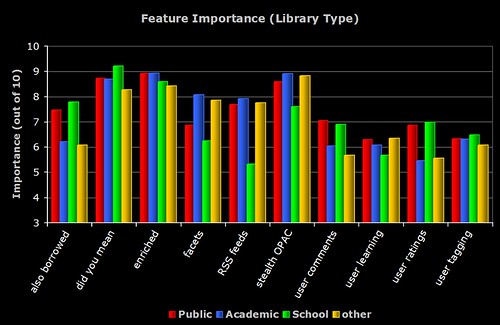
The breakdown of perceived importance by the different types of libraries who responded to the survey. Note the similarities and differences between the Academic and Public respondents.
3) Feature Importance (Country)
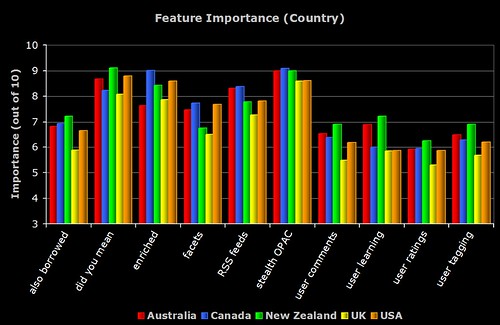
The breakdown of perceived importance by the major countries who responded to the survey. To be included, the country had to have more than 5 respondents.
OPAC Survey results – part 2
Here’s the next batch of results — this time lots of pretty graphs 😉
The shorthand descriptions for the features are as follows:
stealth OPAC — embedding the OPAC in other applications and getting the OPAC to where the user is
did you mean — spelling suggestions for search keywords
enriched — third party book cover scans, table of contents, trusted reviews, etc
RSS feeds — new book lists, RSS feeds of searches, search alerts, etc
facets — faceted browsing of results
also borrowed — “people who borrowed this also borrowed…” suggestions based on circulation data
user tagging — allowing the user to apply their own keywords (tags) to items in the OPAC
user comments — allowing the user to add their own reviews and comments to items in the OPAC
user learning — an “intelligent” OPAC that makes personalised suggestions based on what the user does
user ratings — allowing the user to add their own ratings or scores to items in the OPAC
1) Importance of Features and the Number of Implementations
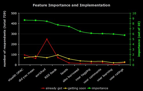
The green line (right hand axis) is the average perceived importance of the 10 OPAC features. The red line is number of respondents who have already implemented the feature, and the yellow line is the number who are planning to implement it soon.
2) Importance of Features and Predicted Number of Implementations
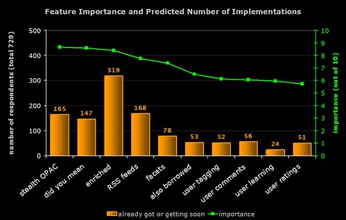
The green line (right hand axis) is the average perceived importance of the 10 OPAC features. The orange bar is number of respondents who have already implemented the feature or who are planning to implement it soon (i.e. the result of combining the red and yellow lines from the previous graph).
Note the high number of implementations of “enriched content”. In general, features with lower perceived importance are less likely to have been (or are about to be) implemented.
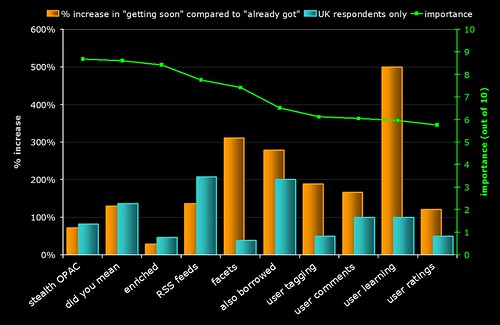
3) Rate of Increase of Feature Implementation
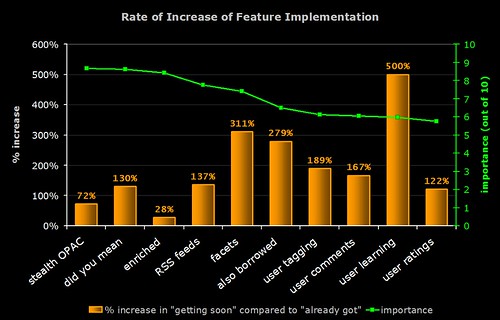
Time for some crystal ball gazing!
The green line (right hand axis) is the average perceived importance of the 10 OPAC features. The orange bar indicates the rate of increase in the implementation of the feature (calculated by dividing the number of people who are planning to implement it by the number of people who already have and expressing the result as a percentage).
For example, 249 respondents already have enriched content and 70 are planning to get it soon:
70 / 249 x 100 = 28.1%
Note that many of the features that (on average) have lower perceived importance are actually the ones whose rate of implementation is highest.
The graph indicates that "learning OPACs" (e.g. OPACs that give the user personalised suggestions and learn from what they do) are potentially the "next big thing"!
4) Feature Importance
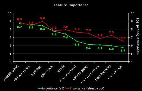
The green line is the average perceived importance of the 10 OPAC features. The red line is the perceived importance from those respondents who have actually implemented that feature.
Note that the difference in the perceived importance of the more "2.0" features (tagging, comments, etc). Does this mean those who have implemented these features are reaping the benefits?
5) Feature Importance
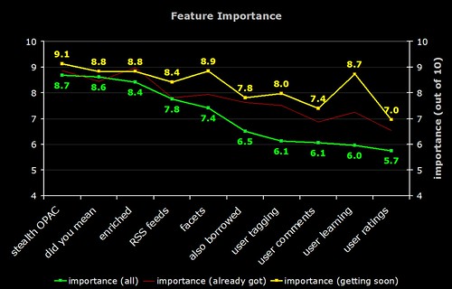
The green line is the average perceived importance of the 10 OPAC features. The faint red line is the perceived importance from those respondents who have actually implemented that feature. The yellow line is the perceived importance from those respondents who are planning to implement that feature soon.
Note that the difference in the perceived importance of the more "2.0" features (tagging, comments, etc). The "getting soon" respondents certainly have high expectations!
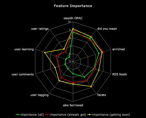
And now, the same data on a radar graph (for those who prefer this format)…
6) Feature Implementation (UK)
The same graph as (3) but with a blue bar showing the rate of implementation in the UK. Why is faceted browsing so low on the agenda for UK libraries? Are US libraries more aware of this feature due to the high publicity surrounding North Carolina’s OPAC?
OPAC Survey results – part 1
A few hours earlier than planned, but the informal OPAC Survey has now closed. Many thanks to everyone who responded — all 729 of you! 🙂
Here’s how the responses break down by geographical region:
After a few days, I added a question that allowed respondents to identify what type of library they worked for — 233 people answered:
Discounting regions and library types where there were 5 or less responses, here’s how the responses broke down for the first 3 sections of the survey…
1) OPAC Happiness
On a scale of 1 to 10 (where 1 is extremely unhappy and 10 is extremely happy), how happy are you with your OPAC?
2) Cutting Edge or Yesterday’s News?
One criticism of OPACs is that they rarely have cutting edge features (or perhaps even basic features) that our users expect from modern web sites. On a scale of 1 to 10, how well do you think your OPAC meets the needs and expectations of your users?
If “2007” represents a cutting edge OPAC with all the features both you and your users would expect, how far in the past do you feel your current OPAC is?
Have you ever suffered from “OPAC envy” when looking at someone else’s OPAC?
3) Child’s play?
On a scale of 1 to 10 (where 10 is extremely easy), how easy do you find your OPAC is to use?
On a scale of 1 to 10 (where 10 is extremely easy), how easy do you think one of your average users finds your OPAC is to use?
On a scale of 1 to 10 (where 10 is extremely important), how important do you think it is that an OPAC is easy and intuitive to use?
Do you run any face-to-face training or induction/introduction courses on “how to use” the OPAC with your users?
…more results to come tomorrow morning!
More Solr fun
Darn, I should have known I was following in a great man’s footsteps…
http://www.code4lib.org/2007/durfee
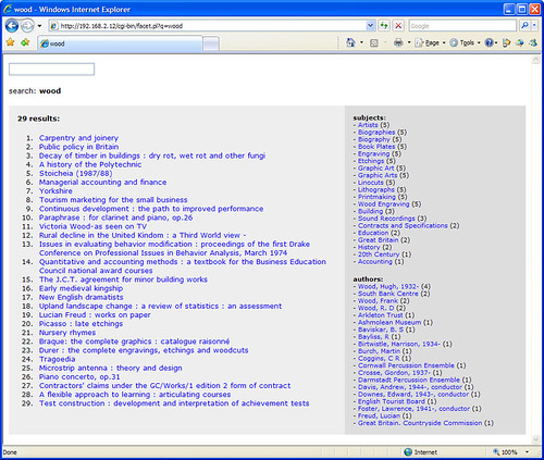
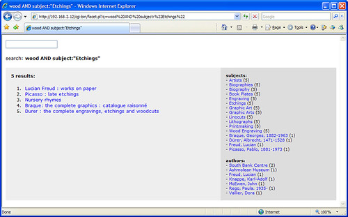
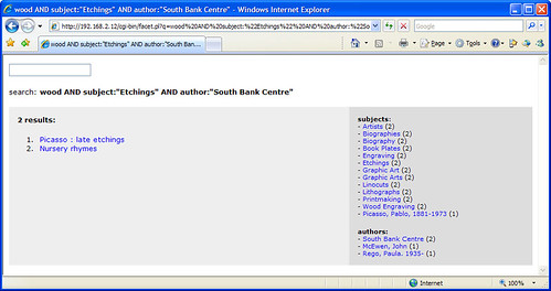
Anyway, a couple more hours of coding has resulted in this…
http://161.112.232.18/modperl/facet6.pl?q=medicine
Hopefully NCSU won’t be setting their lawyers on me (copying is the most sincere form of flattery!), but the prototype has certainly borrowed one or two ideas from their wonderful OPAC.
It’s still a way off being a full OPAC replacement and I need to shrink the book covers down to a more sensible size, but I’m quite chuffed with what I’ve been able to achieve in just a few hours of coding.
Arrghhhhh – Change!
I’m sure Stephen Abram posted his “Change — Arrghhhhh!” article with all of the best intentions in the world, but unfortunately it’s not gone down well with some of the customers…
I assure you, most of us handle change quite well and if none of us wanted major change we wouldn’t be upset about the decision to trash 8.0. In fact, we have asked, begged and demanded change for years and we finally thought we were about to get some. Instead that long awaited “change” has once again been flushed down the toilet.
I was reminded of a stern grownup telling a child that he must take his cod liver oil, because it’s good for him. And I might, if I thought the New Improved Cod Liver Oil had distinct advantages over the old cod liver oil I’ve been taking for years. Problem is, I’m not convinced.
…an incredibly insulting commentary
I also think the article on change has to rate as one of the most offensive and tasteless exercises in corporate public relations ever done.
I must admit that when I read the article, my initial reaction was “what on earth was Stephen thinking when he wrote it?”. Anyway, with a quick shrug of the shoulders, I went back to doing some more coding on the Solr OPAC and the subsequent release of endorphins made me feel much happier! 🙂
I’d definitely be interested to know what some of the Unicorn sites thought of the article.
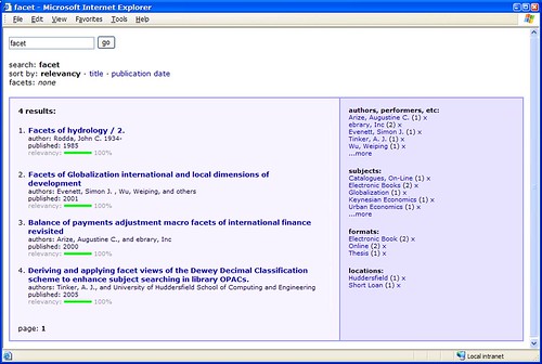
Solr + 2 hours = faceted OPAC
I’ve been meaning to have a play around with Solr, which is…
an open source enterprise search server based on the Lucene Java search library, with XML/HTTP and JSON APIs, hit highlighting, faceted search, caching, replication, and a web administration interface
It’s mostly the “faceted” part I’m interested in and, after a couple of hours of messing around, I’ve got a basic OPAC search interface up and running with around 10,000 records pulled in from our catalogue.
It looks like Solr automatically handles word stems, as searches for “score”, “scores”, and “scoring” find the same results. The results are also relevancy ranked, although I need to find a way to fine tune the default ranking algorithm.
All in all, I’m very impressed with what Solr can do and how quickly it handles searches.