Whilst finalising my presentation for the 2009 UKSG Conference in Torquay, I thought it would be interested to dig into the circulation data to see if there was any indication that our book recommendation/suggestion services (i.e. “people who borrowed this, also borrowed…” and “we think you might be interested in…”) have had any impact on borrowing.
Here’s a graph showing the range of stock that’s being borrowed each calendar year since 2000…
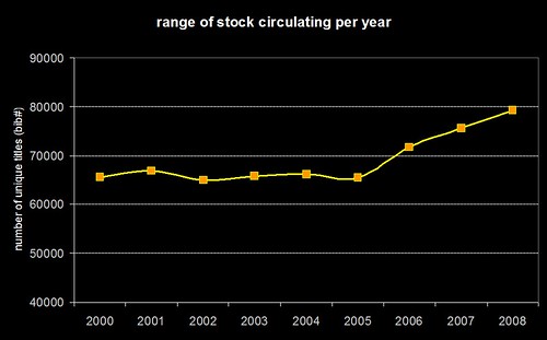
Just to be clear — the graph isn’t showing the total number of items borrowed, it’s the range of unique titles (in Horizon speak, bib numbers) that have been borrowed. If you speak SQL, then we’re talking about a “count(distinct(bib#))” type query. What I don’t have to hand is the total number of titles in stock for each year, but I’d hazard a guess that it’s been fairly constant.
You can see that from 2000 to 2005, borrowing seems to have been limited to a range of around 65,000 titles (probably driven primarily by reading lists). At the end of 2005, we introduced the “people who borrowed this, also borrowed…” suggestions and then, in early 2006, we added personalised “we think you might be interested in…” suggestions for users who’ve logged into the OPAC.
Hand on heart, I wouldn’t say that the suggestions/recommendations are wholly responsible for the sudden and continuing increase in the range of stock being borrowed, but they certainly seem to be having an impact.
Hand-in-hand with that increase, we’ve also seen a decrease in the number of times books are getting renewed (even though we’ve made renewing much easier than before, via self-issue, telephone renewals, and pre-overdue reminders). Rather than hanging onto a book and repeatedly renewing it, our students seem to be exploring our stock more widely and seeking out other titles to borrow.
So, whilst I don’t think there’s a quick any easy way of finding out what the true impact has been, I’m certainly sat here with a grin like a Cheshire cat!
Category: Usage Data
3 Million
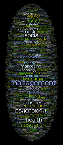
Aaron’s cool Wordle visualisations prompted me to have a look at our ever growing log of OPAC keyword searches (see this blog post from 2006). We’ve been collecting the keyword searches for just over 2.5 years and, sometime within the last 7 days, the 3 millionth entry was logged.
Not that I ever need an excuse to play around with Perl and ImageMagick, but hitting the 3 million mark seemed like a good time to create a couple of images…
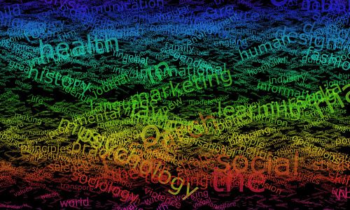

The only real difference between the two is the transparency/opacity of the words. In both, the word size reflects the number of times it has been used in a search and the words are arranged semi-randomly, with “a”s near the top and “z”s near the bottom.
If I get some spare time, it’ll be interesting to see if there are any trends in the data. For example, do events in the news have any impact on what students search for?
The data is currently doing a couple of things on our OPAC…
1) Word cloud on the front page, which is mostly eye candy to fill a bit of blank space
2) Keyword combination suggestions — for example, search for “gothic” and you should see some suggestions such as “literature”, “revival” and “architecture”. These aren’t suggestions based on our holdings or from our librarians, but are the most commonly used words from multi keyword searches that included the term “gothic”.
..and, just for fun, here’s the data as a Wordle:

Free book usage data from the University of Huddersfield
I’m very proud to announce that Library Services at the University of Huddersfield has just done something that would have perhaps been unthinkable a few years ago: we’ve just released a major portion of our book circulation and recommendation data under an Open Data Commons/CC0 licence. In total, there’s data for over 80,000 titles derived from a pool of just under 3 million circulation transactions spanning a 13 year period.
https://library.hud.ac.uk/usagedata/
I would like to lay down a challenge to every other library in the world to consider doing the same.
This isn’t about breaching borrower/patron privacy — the data we’ve released is thoroughly aggregated and anonymised. This is about sharing potentially useful data to a much wider community and attaching as few strings as possible.
I’m guessing some of you are thinking: “what use is the data to me?”. Well, possibly of very little use — it’s just a droplet in the ocean of library transactions and it’s only data from one medium-sized new University, somewhere in the north of England. However, if just a small number of other libraries were to release their data as well, we’d be able to begin seeing the wider trends in borrowing.
The data we’ve released essentially comes in two big chunks:
1) Circulation Data
This breaks down the loans by year, by academic school, and by individual academic courses. This data will primarily be of interest to other academic libraries. UK academic libraries may be able to directly compare borrowing by matching up their courses against ours (using the UCAS course codes).
2) Recommendation Data
This is the data which drives the “people who borrowed this, also borrowed…” suggestions in our OPAC. This data had previously been exposed as a web service with a non-commercial licence, but is now freely available for you to download. We’ve also included data about the number of times the suggested title was borrowed before, at the same time, or afterwards.
Smaller data files provide further details about our courses, the relevant UCAS course codes, and expended ISBN lookup indexes (many thanks to Tim Spalding for allowing the use of thingISBN data to enable this!).
All of the data is in XML format and, in the coming weeks, I’m intending to create a number of web services and APIs which can be used to fetch subsets of the data.
The clock has been ticking to get all of this done in time for the “Sitting on a gold mine: improving provision and services for learners by aggregating and using learner behaviour data” event, organised by the JISC TILE Project. Therefore, the XML format is fairly simplistic. If you have any comments about the structuring of the data, please let me know.
I mentioned that the data is a subset of our entire circulation data — the criteria for inclusion was that the relevant MARC record must contain an ISBN and borrowing must have been significant. So, you won’t find any titles without ISBNs in the data, nor any books which have only been borrowed a couple of times.
So, this data is just a droplet — a single pixel in a much larger picture.
Now it’s up to you to think about whether or not you can augment this with data from your own library. If you can’t, I want to know what the barriers to sharing are. Then I want to know how we can break down those barriers.
I want you to imagine a world where a first year undergraduate psychology student can run a search on your OPAC and have the results ranked by the most popular titles as borrowed by their peers on similar courses around the globe.
I want you to imagine a book recommendation service that makes Amazon’s look amateurish.
I want you to imagine a collection development tool that can tap into the latest borrowing trends at a regional, national and international level.
Sounds good? Let’s start talking about how we can achieve it.
FAQ (OK, I’m trying to anticipate some of your questions!)
Q. Why are you doing this?
A. We’ve been actively mining circulation data for the benefit of our students since 2005. The “people who borrowed this, also borrowed…” feature in our OPAC has been one of the most successful and popular additions (second only to adding a spellchecker). The JISC TILE Project has been debating the benefits of larger scale aggregations of usage data and we believe that would greatly increase the end benefit to our users. We hope that the release of the data will stimulate a wider debate about the advantages and disadvantages of aggregating usage data.
Q. Why Open Data Commons / CC0?
A. We believe this is currently the most suitable licence to release the data under. Restrictions limit (re)use and we’re keen to see this data used in imaginative ways. In an ideal world, there would be services to harvest the data, crunch it, and then expose it back to the community, but we’re not there yet.
Q. What about borrower privacy?
A. There’s a balance to be struck between safeguarding privacy and allowing usage data to improve our services. It is possible to have both. Data mining is typically about looking for trends — it’s about identifying sizeable groups of users who exhibit similar behaviour, rather than looking for unique combinations of borrowing that might relate to just one individual. Setting a suitable threshold on the minimum group size ensures anonymity.
Coming soon, to a blog near here…
Okay — I’m the first to admit I don’t blog enough… I still haven’t even blogged about how great Mashed Library 2008 was (luckily other attendees have already blogged about it!)
Anyway, unless I get run over by a bus, later on this week I’m going to post something fairly big — well, it’s about 90MB which perhaps isn’t that “big” these days — that I’m hoping will get a lot of people in the library world talking. What I’ll be posting will just be a little droplet, but I’m hoping one day it’ll be part of a small stream …or perhaps even a little river.

(view slideshow of Mashed Library 2008)
Dewey friend wheel
I’ve been meaning to have a stab at creating something similar to a friend wheel, but using library data, for a while now. Here’s a prototype which uses our “people who borrowed this, also borrowed…” data to try find strong borrowing relationships…
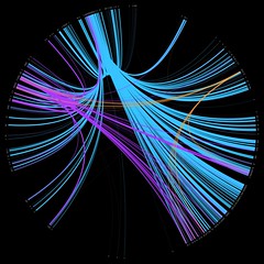
I picked three random Dewey numbers and hacked together a quick PerlMagick script to draw the wheel:
- 169 – Logic -> Analogy (orange)
- 822 – English & Old English literatures -> Drama (purple)
- 941 – General history of Europe -> British Isles (light blue)
The thickness and brightness of the line indicates the strength of the relationship between the two classifications. For example, for people who borrowed items from 941, we also see heavy borrowing in the 260’s (Christian social theology), 270’s (Christian church history), and the 320’s (Political science).
The next step will be to churn through all of the thousand Dewey numbers and draw a relationship wheel for our entire book stock. I’ve left my work PC on to crunch through the raw data overnight, so hopefully I’ll be able to post the image tomorrow.
Playing with Processing
Iman first mentioned Processing ages ago, but it’s only recently I’ve gotten around to having a play with it.
So, this is my first stab at coming up with something visual and it’s in the same vein as Dewey Blobs…
…you’ll need Java installed to view it.
Rather than lay Dewey out on a 2D gird, I’m using a 10x10x10 cube (000 is at the front-top-left and 999 is at the back-bottom-right of the cube). The code then cycles through all of the check-outs (orange) and check-ins (blue) from a single day, with a zigzagging 3D line linking up the previous transactions.
What I originally wanted to achieve was to have two curving lines, snaking their way through the cube, but figuring out how to do the Bezier curves made my brain hurt 😉 Anyway, if you want to see a version where the line runs more quickly, click here — it’s harder to read the book titles, but the lines fade away more realistically. Or, here’s a 3rd version that doesn’t include the Dewey classification or book title.
A word of warning: the Java might chomp away at your CPU, so I’m not sure how well it’ll run on a slower PC.
Dewey Blobs
I’ve been fascinated by data visualisation for a year or two now, and I’ve recently been chatting to my good friend Iman about doing something with our circulation data. In particular, something that will be visually interesting to look at, whilst also giving you a feel for the data.
I’ve tried a few different things, but the Dewey Blobs are currently my favourite…
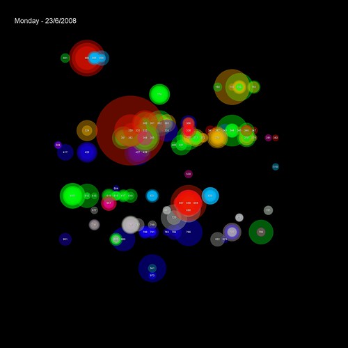
(items borrowed on 23rd June)
The transactions are placed on a 32×32 grid based on their Dewey classification (000-999). Each transaction is shown as a semi-transparent circle with two attributes:
1) colour — based on the School the student making the transaction studies in
2) size — based on the popularity of the book (the larger the circle, the more times it’s been borrowed before)
Where many students from the same school borrow from the same Dewey classification on the same day, the colour is reinforced. If the borrowing is from multiple schools, then the colours begin to blend to create new hues.
For example, on this day the vast majority of transactions in the 300s were by Human & Health students (green)…

…but a couple of days later, the borrowing in the 300s is more complex, with students from several schools appearing (Business students are red and Music & Humanities students are blue)…

You can browse through a few of the blobs on Flickr.
Show Us a Better Way
Thanks to Iman Moradi for highlighting this site:
Show Us a Better Way
Tell us what you’d build with public information and we could help fund your idea!
Ever been frustrated that you can’t find out something that ought to be easy to find? Ever been baffled by league tables or ‘performance indicators’? Do you think that better use of public information could improve health, education, justice or society at large?
The UK Government wants to hear your ideas for new products that could improve the way public information is communicated.
To show they are serious, the Government is making available gigabytes of new or previously invisible public information especially for people to use in this competition.
Go on, Show Us A Better Way.
The UK Government has come under a lot of criticism in the last few years for not making publicly funded data available, so does this mark a sea change in attitude?
My second thought when I read the web page was that you could do the same with your library… although I’m not suggesting you offer a top prize of £20,000!
Show Us a Better Way
Tell us what you’d do to improve the library and we could make it a reality!
Ever been frustrated that you can’t find out something that ought to be easy to find? Ever been baffled by library resources or the library services on offer?
We want to hear your ideas for new ways that we can improve how our services.
Go on, Show Us A Better Way.
Alternatively, as we begin to make our library data available for re-use, this would be a great way of promoting unintended uses.
Google Graphs
We’ve had loan data on the OPAC for a couple of years now, although it’s only previously been visible to staff IP addresses. Anyway, a couple of months ago, I revamped it using Google Graphs and I’ve finally gotten around to adding a stats link that anyone can peruse — you should be able to find it in the “useful links” section at the foot of the full bib page on our OPAC.
As an example, here are the stats for the 2006 edition of Giddens’ “Sociology“…
2008 — The Year of Making Your Data Work Harder
Quite a few of the conversations I’ve had this year at conferences and exhibitions have been about making data work harder (it’s also one of the themes in the JISC “Towards Implementation of Library 2.0 and the E-framework” study). We’ve had circ driven borrowing suggestions on our OPAC since 2005 (were we the first library to do this?) and, more recently, we’ve used our log of keyword searches to generate keyword combination suggestions.
However, I feel like this is really just the tip of the iceberg — I’m sure we can make our data work even harder for both us (as a library) and our users. I think the last two times I’ve spoken to Ken Chad, we’ve talked about a Utopian vision of the future where libraries share and aggregate usage data 😀
There’s been a timely discussion on the NGC4Lib mailing list about data and borrower privacy. In some ways, privacy is a red herring — data about a specific individual is really only of value to that individual, whereas aggregated data (where trends become apparent and individual whims disappear) becomes useful to everyone. As Edward Corrado points out, there are ways of ensuring patron privacy whilst still allowing data mining to occur.
Anyway, the NGC4Lib posts spurred me on into finishing off some code primarily designed for our new Student Portal — course specific new book list RSS feeds.
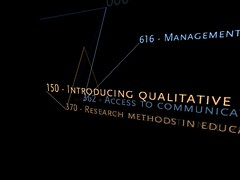
The way we used to do new books was torturous… I’ve thankfully blanked most of it out of my memory now, but it involved fund codes, book budgets, Word marcos, Excel and Borland Reportsmith. The way we’re trying it now is to mine our circulation data to find out what students on each course actually borrow, and use that to narrow down the Dewey ranges that will be of most interest to them.
The “big win” is that our Subject Librarians haven’t had to waste time providing me with lists of ranges for each course (and with 100 or so courses per School, that might takes weeks). I guess the $64,000 question is would they have provided me with the same Dewey ranges as the data mining did?
The code is “beta”, but looks to be generating good results — you can find all of the feeds in this directory: https://library.hud.ac.uk/data/rss/courses/
If you’d like some quick examples, then try these:
- Entrepreneurship MSc (course details)
- Management by Action Learning MA (course details)
- Youth and Community Work BA(Hons) (course details)
- Performing Arts (Performance) FdA (course details)
- Early Primary Education BA(Hons) (course details)
- Logistics and Supply Chain Management BSc(Hons) (course details)
- Fashion Design (Top-up) BA(Hons) (course details)
- Product Design BA/BSc(Hons) (course details)
Is your data working hard enough for you and your users? If not, why not?